Spring Decoration
31.03.2025
Despite enjoying the hibernation months, this spell of sunny weather has been the ultimate mood booster. It does wonders in washing away brain fog, giving me and everyone in the office a boost of inspiration for the studio. This is especially welcomed whilst in the midst of dirty build works!
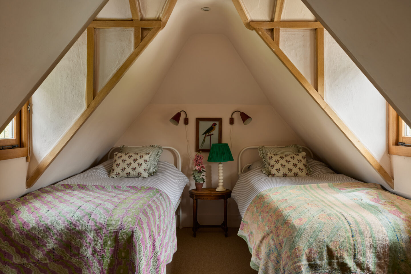
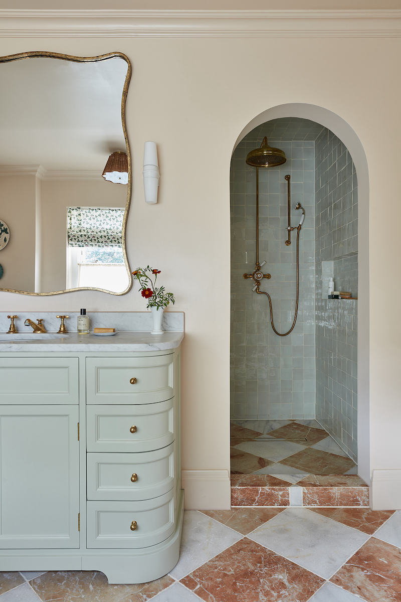
For this journal we wanted to delve into the thought process behind the living room at our recently completed project in Fernhurst. We’re then sharing our Spring shopping list, a collection of lovely things we have sourced for our projects and our homes.
Before we dive in and to kick off the Spring thread, here are a few warmer day cliches I can’t wait for; al-fresco dining, cut flowers, sun-dried washing, warmer evenings, linen clothing, spring table-scaping, strawberry season and of course, an Aperol.
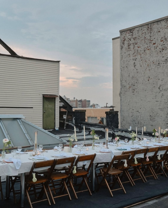
| Image found via Instagram account – @shtick_nyc |
Buttery yellow living
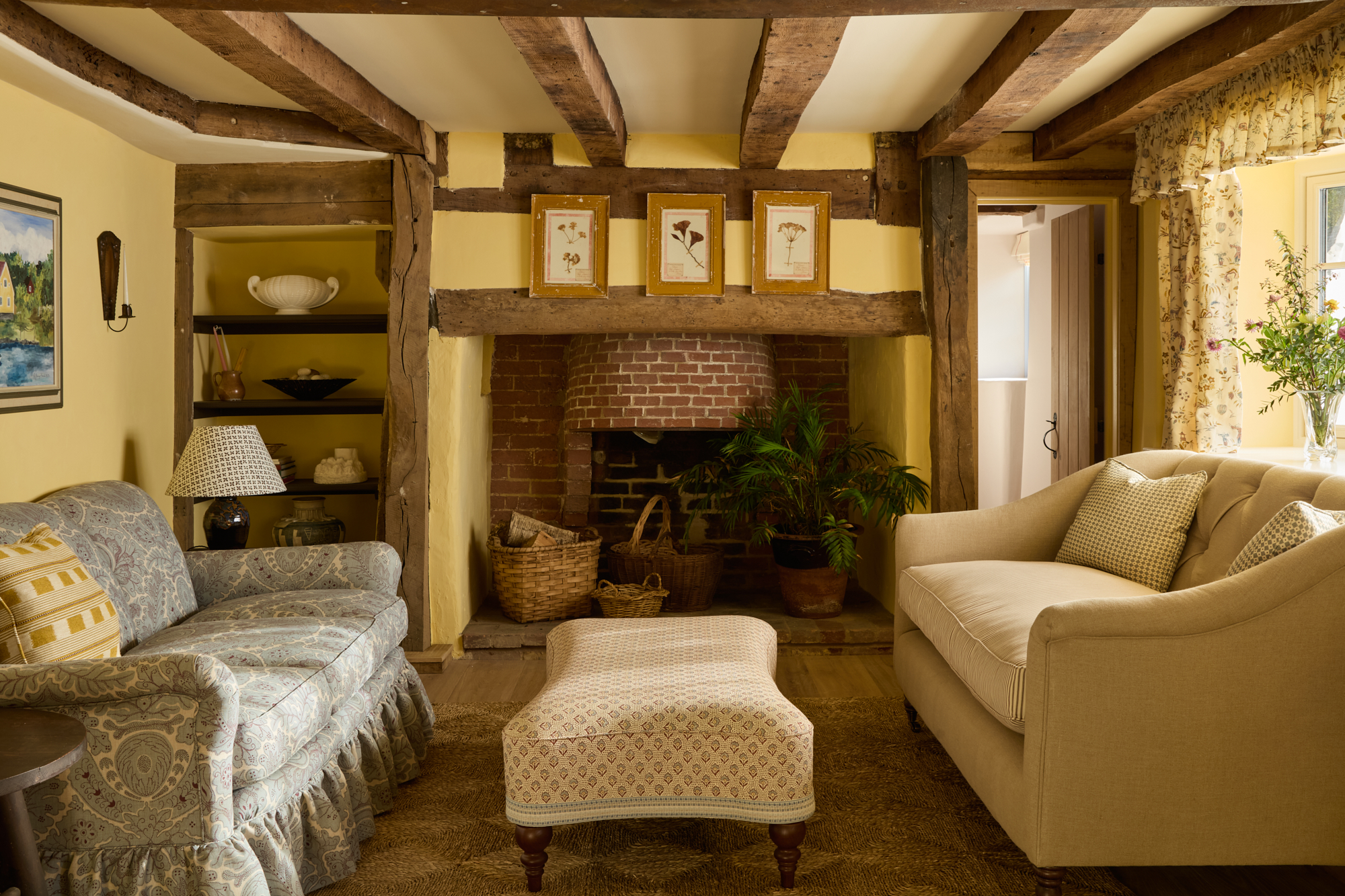
Trend forecasting is always prevalent at the beginning of the year. Go-to paint colours has to be amongst the most frequently asked questions and we keep going back to Fede’s Ochre by Francesca’s Paints that we painted the living room in at our project in Fernhurst. It made us think we ought to chat about this space for our lovely newsletter subscribers.
Creating an effortless, timeless interior (with a twist) that carefully considers the style of a building is at the forefront of our heads when putting any space together. With low ceilings and wonky beams this room has a natural cosy feel, we chose to lean into this but brighten it up with sunny yellow walls and a mix of fabrics.
We always knew we wanted to use Passe-Temps by Namay Samay for the window dressing. This intricate print compliments the colour of the walls but stands out in its’ own right. The frills were designed to create a country cottage statement, and to frame this beautiful bay window.
For the rest of the textile sourcing, we didn’t follow any rule book. The whole idea was for it to feel eclectic and layered. If we were to stick to a certain colour palette, it could’ve felt somewhat contrived. For the sofas, we used contrasting fabrics; Etienne Moonstone by Lewis & Wood and brown Ticking Stripe by Ian Mankin. The cushions were in Diamond Dot, Wedgewood Blue by Lewis & Wood and the ottoman in Speedwell Redwood by Lewis & Wood.
To tie up and ground the space, we had a large rug made by the talented Seagrass story, you really can never go wrong with one of her rugs. We then made a conscious decision to leave the fireplace untouched, it was super important to ensure we were showing off the lovely bones that this property has to offer.
As ever, we went all out on the antiques and sourced a mixture of artwork, accessories and trinkets from some of our favourite suppliers. If you haven’t already, add these to your vintage list: Vintage on the Vine, Pato, TAT London, Four Quarters Home, Kernow Furniture, Tarn and Custodian.
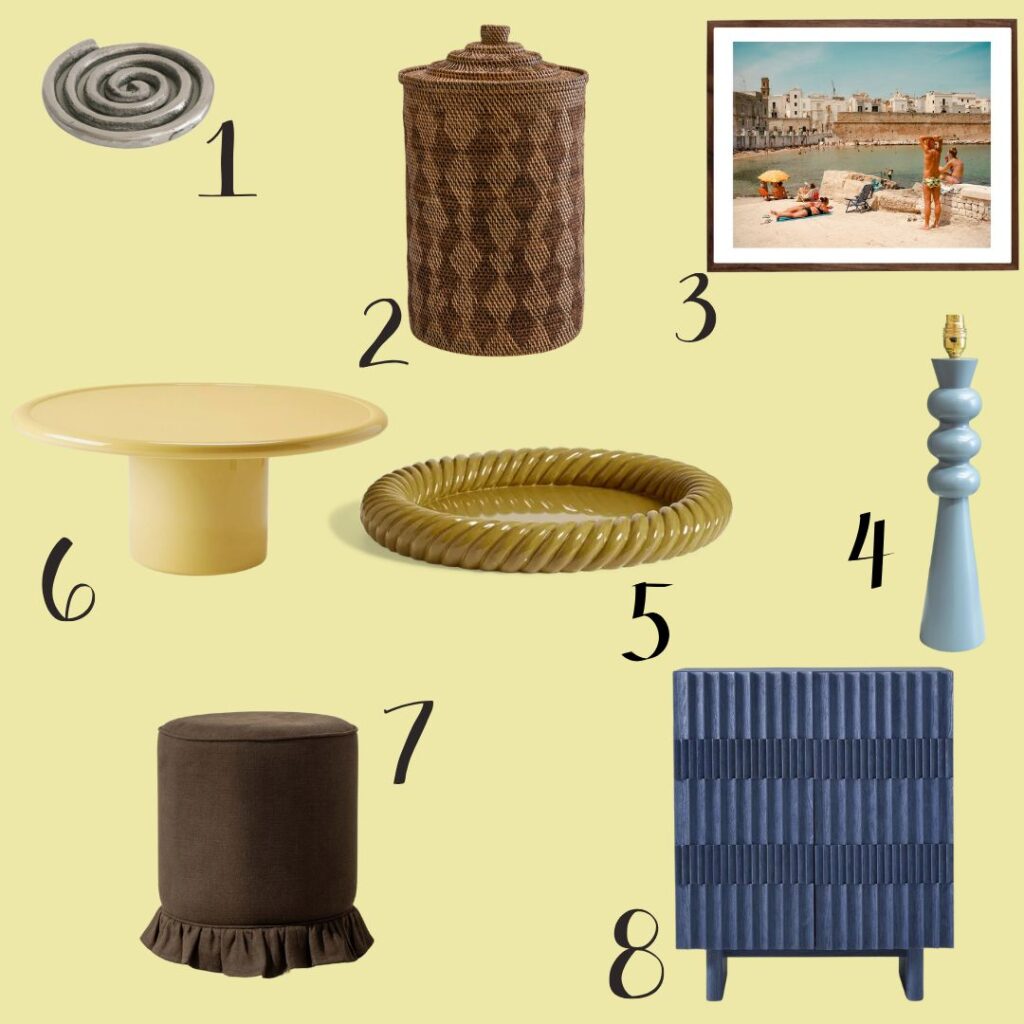
Spring shopping
With a new season on the horizon, we wanted to shout out some of our favourite pieces that will give your home a spring feel even on grey rainy days.
2/How to make your washing look pretty
3/Summer day dreaming photography
5/Oka tray, perfect addition to any space
8/A statement cabinet to hide all of your nic nacs